Below I give you my tips and tricks to easily (*) create
maps for Cry Havoc.
(*) : Note however that easily
is not synonymous with quickly!
|
|
 The tools you will need
 |
|
|
I use fairly standard stuff which can be bought in any Arts
& Crafts shop |
|
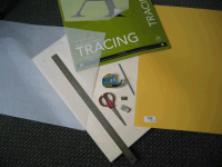 |
> Canson Mixed
Media paper: This is a heavyweight (224g/138lb) and
easily erasable paper for artists.
> A drawing
board: Not mandatory, but an easy way to handle the
paper without risking to crease it.
> Tracing
paper
>
One rule of at least 30 cm/1 foot in
length.
> One B
pencil to draw the various map features. An eraser;
some removable tape and a pair of scissors.
> 2 felt-tip
pens in size 005 and 01.
> One existing map of the
Norman Saga series with limited features (The Islet,
the Crusaders' Trail or The Desert are great). |
|
 The hex grid
 |
|
|
|
I used to hand draw the hex grid, wich was a fairly long and
painful process. I now switched to a digital hex grid and
only draw the various map features.
> And here is
the hex grid I use for my maps (Standard A2
size), and the
Reduced A4 size for your drafts. You can use it for your
sketches but you probably won't be able to use it to draw a
map.
> Here is
the that I've been using for my maps. |
|
 Designing the base map
 |
|
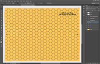 |
I no longer use yellow colored cardboard for my base maps.
> I created a flat
terrain image that I now use for all my maps.
> The final
Photoshop template contains the yellow base map, the hex
grid on another layer, and the side numbers and titles on
independent text layers.
> This saves time,
but above all it guarantees that from one map to the
another, the color will be uniform.
> Next, I include the
map features on individual layers |
|
 Penciling the map features
 |
|
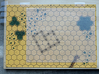 |
I no longer draw the entire map, but only portions, which
allows me to do all the work at home with an A4 scanner.
> I paste an existing
map with the standardized hexagonal grid on my drawing
board, then I paste a sheet of tracing paper on top and draw
the feature on the layer with the B pencil following the
outline of the hexagons.
> I then highlight
the line with a felt-tip pen directly on the tracing paper.
> I then
conscientiously erase all traces of pencil (or fingers...).
|
|
|
This is for the process. But just as important is the style,
to make sure your map will look like a Cry Havoc map. Below
my recommendations :
>
My only advice at this stage is to take inspiration from the
original illustrators (Gary Chalk, Peter Dennis) and do as
they did! Proceed section by section.
> Tip:
Practice rounding off the corners: the stones, the slabs
must not have any sharp corners (or at least, this is how
Gary Chalk and Peter Dennis defined the Tables of the Law).
> Tip:
Do not waste time at this stage in representing all the
details, especially those that are repetitive and easy to
reproduce freehand: for example the grooves of cut tree
trunks, the uneven lines of ditches, etc. On the other hand,
draw everything that can easily deviate: the slope lines,
the stones, the floor slabs, etc. |
|
 Highlighting the map features
 |
|
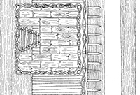 |
This is the crucial phase that will transform your manual
work into a real Cry Havoc map! You will need 2 or 3 types
of fine or ultra fine tip felt pens:
> 1 pigment tracer as
thin as possible. The smallest size found in stationery
stores is 0.05, which corresponds to lines 0.20 mm thick.
This is the one with which you will highlight most of the
lines requiring great finesse (stones, slabs, boards, etc.).
> 1 fine point
type V5 (sometimes called ultra fine, but don't be fooled by
these names: ultra fine means in our case coarse line!). You
will use it for slope lines (banks, ditches) or for filling
areas (shadows, dirt spots). >
Tip: Absolutely ban the use of the ruler in
this phase to highlight straight lines: these are boards,
stairs, slabs. Any element that in nature is not perfectly
straight. Practice beforehand if you are not sure of your
hand, and remember that it is the sum of the imperfections
of the Cry Havoc maps that paradoxically make them standout
as they don't look computer-generated!
> Tip:
Resist the temptation to start by highlighting the most
beautiful parts of your map: practice first on less
"significant" parts to be in top shape when you work on the
parts that will capture the players' first attention.
> Tip:
Don't underestimate the importance of details and the time
needed to make them. They are what make the difference
between a good map and a great map. Some examples:
- The
little black dots at the foot of the walls to represent
dirt,
- The little triangular shadows on the steps of
the stairs,
- The nails on the boards,
- The little
stones on the floor hexes. |
|
 Scanning the drawing
 |
|
|
> Scan the drawing at
300 DPI and finish cleaning it up in Photoshop. Note:
Scanning tracing paper can be tricky and you have to adjust
the brightness and contrast carefully to avoid having too
many pencil marks that will then have to be erased
digitally.
> Zoom in at 400% and
inspect your drwaing carefully to correct any imperfection,
erase pencil marks, etc. or you won(t be able to cut out the
various elements.
> Keep a white
background when cutting out your various elements to make
sure the background terrain will not see through when adding
them to the map. Make sure that the black lines of your
drawings are not open ended, or the cut out won't be
correct. |
|
 Painting the map features
 |
|
 |
This is the (very) big change compared to what I did
initially:
> Painting a map with
gouache or acrylic brings a certain richness to the result,
with all the nuances of color, and avoids the uniform
appearance of the colors of a digital palette. But the
constraint is the time needed to do a lot of retouching on
Photoshop once the drawing is scanned.
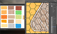
> So I decided to
combine the 2 by creating an acrylic color palette that I
then scanned. I now color directly in Photoshop using the
Stamp tool.
> Advantages: Time
saving (even if the whole thing remains tedious, like
representing the Murus Gallicus boards in OPPIDUM in 3 close
but different shades). And from one map to another,
recurring elements like the slopes or the boards always have
the same color. |
|
 Final rendering
 |
|
|
|
> The last touch to
get a real Cry Havoc map remains: the texts.
The
official Cry Havoc font is "Souvenir" in Bold/Italics.
Here are the sizes to use for the different elements:
-
Title: 32 points
- Descriptions and subtitles: 20 points
- Sides: 24 points |
|
|
You will need 2 types of output for the file:
- a GIF at
72 DPI for Vassal,
- a TIFF at 300 DPI for printing. |
|
> Et voilà! In total,
count between 10 and 20 hours of work per map to complete
all these phases. Previously, when I was drawing the hex
grid and painting the map with acrylic colors, it was
between 30 and 40 hours, so definitely an improvement. This
may seem very long, especially when you can generate a map
in 30 minutes by simply copying and pasting existing
elements, but the quality and satisfaction of a job well
done come at this price. |
