|
|
 |
Resources
|
 |
|
|


|
 |
Below I give you my tips and tricks to easily make (*)
counters for Cry Havoc if like me you don't have drawing
skills.
(*) : Note however that easily is not synonymous
with quickly!
|
|
 Choosing your subject
 |
|
This is a crucial step. After choosing your theme, try to
find an illustration (drawing, photo, etc.) representing
your character. The
Osprey booklets
immediately come to mind, but there are also excellent
sources in illustrated historical albums for children or
more simply by typing a few keywords in Google and then
checking in the Image section. I typically use Pinterest and
store potential characters by periods. |
|
 |
> Drawings are
preferable to photos because they are easier to reproduce.
And paradoxically, B&W line drawings are easier to reproduce
than color illustrations.
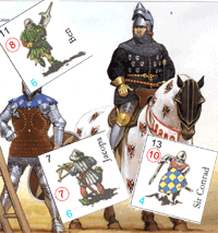
> Remember that
your character will ultimately have to be in the center of a
small counter measuring 1.8 cm on each side. A superb
illustration of a rider seen from the side is therefore not
the most suitable. Prefer riders seen from the front or back
(or at a slight angle) and in which the distinctive elements
(shield, weapon, helmet) stand out well. Slender characters
will not render well either once scaled, so prefer plump
characters "à la
Angus McBride", or even seen with a slight dive that
compresses them. Gary Chalk understood this well when he
made the first Cry Havoc counter sheets.
Peter Dennis for Siege remained more conventional and
the result is less convincing, even coming from Peter!
> Tips:
The difficulty of drawing is to obtain a dynamic pose and
correct proportions. The dressing is however quite easy with
good documentation. So do not hesitate to convert an Aztec
into a Varangian guard if you want with the method below. In
the long run, I realized that the best sources are
characters from Antiquity, or in any case as undressed as
possible, because it is easy to dress them again afterwards. |
|
 Drawing the character
 |
 |
No more hand drawing with tracing paper! That's how I did
all the characters until Oppidum, but this was really
fastidious. You can check the pictures of the process in the
related
French page which has been up for a much longer time
than this newly created page in 2024.
> I draw with the
mouse directly in Photoshop, from the chosen illustration.
> Then I retouch the
line in Photoshop. Drawing with the mouse is not very
precise, but it is still better than the drawing tablet: I
invested in a tablet, tried it for one day and quickly
returned the tablet to its supplier because it is really too
difficult to use! |
|
 Standardization
 |
|
Over time, I have standardized a number of processes to
ensure a consistent result from one character to another: |
 |
>
Drawing size: I adjust the illustration to get a
character between 1500 (pedestrian) and 2000 (rider)
pixel-high at 300 DPI. It's big, but it allows to get a lot
of details.
> Digital
pencil size: I use a 3-pixel pencil for the main
lines, and 2px for details or fine lines (like hair).
> Shadow
color: I create a layer with 50% opacity and use a
color with the hexadecimal code 3e3e3e. |
|
 Coloriser les personnages
 |
 |
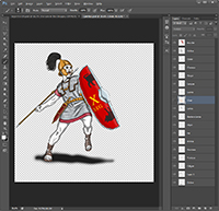
> You will need to
create a layer per color, which will allow you to vary the
colors later when you make variations of the same character.
In the attached example, there are 14 different colors
(tunic, chainmail, tunic belt, flesh, lips, throat or hair).
Another layer is used to mark the shadows. The shadow on the
ground is another layer. The shield and pilum are imported
from other files and are the subject of separate layers.
> Tip:
Except for the layer with the illustration path and those of
accessories imported from other files, choose the Multiply
mode for all the color layers.
> Tip:
For the shadow, set the opacity to 50% so that the colors
show through. Use a brush with soft edges of 20 px in
diameter.
> Tip:
Mark the overexposed areas (the opposite of the shadow) on
each color layer with a 20px diameter soft-edged eraser with
an opacity of 20%.
> Tip: Do
not colorize accessories (weapons, shields, etc.) directly
in the character file. Instead, create them in a separate
file and then import them. This will make it easier to vary
the colors or patterns of a shield to use it with multiple
characters.
> Tip: Avoid
white, black and gray for your basic characters, because you
will not be able to make variations later. For example,
always create your bay horses, and then play on the contrast
to obtain black, white or gray coats. |
|
 Creating variations
 |
 |
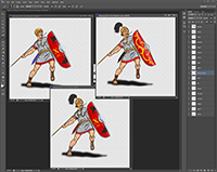
> To get variants of
your character, change the colors of the horses' coat and
saddle, change the head and weapons. You can play on the
presence or absence of a coat.
> To create the
Wounded pose, damage the shield and weapon, add a few
arrows, tear the clothes, make the blood spurt and modify
the head and arms.
> You now need to
find illustrations of knocked out and dead characters to
finish an infantryman, and illustrations of a horse without
a rider and dead for the riders...
In total, count between 4 to 5 hours of work per character
and per pose (knowing that the wounded chaarcters are made
much more quickly). So let's say 12 to 15 hours for an
infantryman and double for a rider. This may seem very long,
especially when you can generate a character in 10 minutes
by scanning and cleaning an existing illustration, but you
won't have all the poses and all your patching will be
highly visible because there was only one Angus McBride and
you don't have (just like me) his talent!
|
|
 Prepare the counter sheet
 |
> Once your
characters are ready in the different poses, flatten the
Photoshop file, reduce the height to 400px for the
characters on foot and 600px for the riders. Convert the
color mode to CMYK and save in EPS format.
> All you have to do
is install the characters on the attached template (A4
format. We have also included the typical font of the series
games for Windows).
> Add the names and
values of movement and combat. Here is a beautiful board
of pawns that is ready to go to print.
> You will need 2
types of output for the file:
- a GIF at 72 DPI for
Vassal,
- an EPS in 300 DPI for printing.
And
there you have it, it's done! It's not very difficult since
I can do it, but it is very long. The quality and
satisfaction of a job well done are at this price. |
|
|
|
|
|
|
|
|
|
|
|
